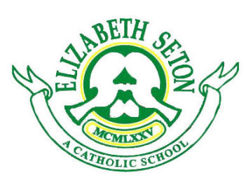

The ESS Logo is tricolor: green, white, and yellow.
It contains two doves encased in a circle with widespread wings and
protruding tails. The name of the
patron is written in bold letters above the circle while the year of its
founding is indicated by numerals below the doves.
The Catholic orientation of the school is proudly proclaimed in the
spread out scroll.
Green
Represents
life and vitality. As an
institution, the school is dedicated to growth and development, which
characterizes life
White
Symbolizes the purity and clarity of intentions of the institution.
The Mission Statement clearly defines its identity as a Filipino Catholic
school devoted to the pursuit of academic excellence
Yellow
Suggests light, inspiration, and wisdom.
It draws light, inspiration, and wisdom from the Lord and continues to
seek guidance through the intercession of its great Patroness, Mother Elizabeth
Ann Seton
The
circle
implies that learning is a continuous endeavor.
It is a never-ending process.
There are always new ideas to learn as human beings go through life.
The
two doves
facing each other suggest cooperation and solidarity.
ESS promotes healthy human interpersonal relationships.
Although there are diverse needs and concerns among its stakeholders
everyone is united by a common goal and aspiration: excellent education for the
youth.
The
widespread wings
and
protruding tails
of the doves
represent the idea that learning stretches far and beyond the classroom walls.
The world is a classroom.
And ESS pupils should continue to seek knowledge and truth anywhere and
everywhere as they go through life.